
The modern business environment is defined by an explosion of data, yet many organizations suffer from "information overload." In 2026, the challenge for leadership is no longer about gathering data, but about translating that data into immediate action. Traditional complex reporting tools often create friction, requiring specialized training and hours of manual analysis to extract even basic insights.
We360.ai simplifies this process through an intuitive, user-centric workforce analytics platform designed for high-impact decision-making. By prioritizing a "Dashboards That Just Work" philosophy, the software ensures that critical performance metrics are accessible to everyone—from CXOs to department managers—without the need for technical expertise. This clarity transforms how teams operate, replacing guesswork with data-backed confidence.
Effective dashboard design is a critical bridge between raw information and strategic knowledge. When an interface is simple and structured, it reduces cognitive load, allowing managers to focus on growth rather than navigating complicated software.
The Modern Management Challenge: Overcoming Dashboard Fatigue
In an era of distributed and hybrid work, managers face a paradox: they have more digital signals than ever, but less actual visibility into team health. Many legacy productivity monitoring tools are built with a focus on data volume rather than user experience, leading to several operational hurdles:
- Cognitive Overload: Complex layouts with excessive charts confuse users, making it difficult to identify the most important "Daily Wins" or urgent risks.
- Decision Latency: When insights are buried under layers of navigation, leaders miss the window to intervene in critical situations.
- Low Adoption Rates: If software is too difficult to use, managers revert to "gut feel" decision-making, wasting the organization's investment in technology.
- Inconsistent Data Interpretation: Without a clear visual hierarchy, different stakeholders may interpret the same raw data in conflicting ways.
- Accessibility Barriers: Many enterprise tools lack responsive design, preventing leaders from accessing vital metrics on mobile devices while on the go.
These challenges turn a potential asset into a burden. Research shows that excessively complex dashboards reduce decision efficiency, while streamlined, intuitive interfaces significantly enhance both speed and accuracy. To stay competitive in 2026, businesses must transition from reactive reporting to proactive planning through simplified UX.
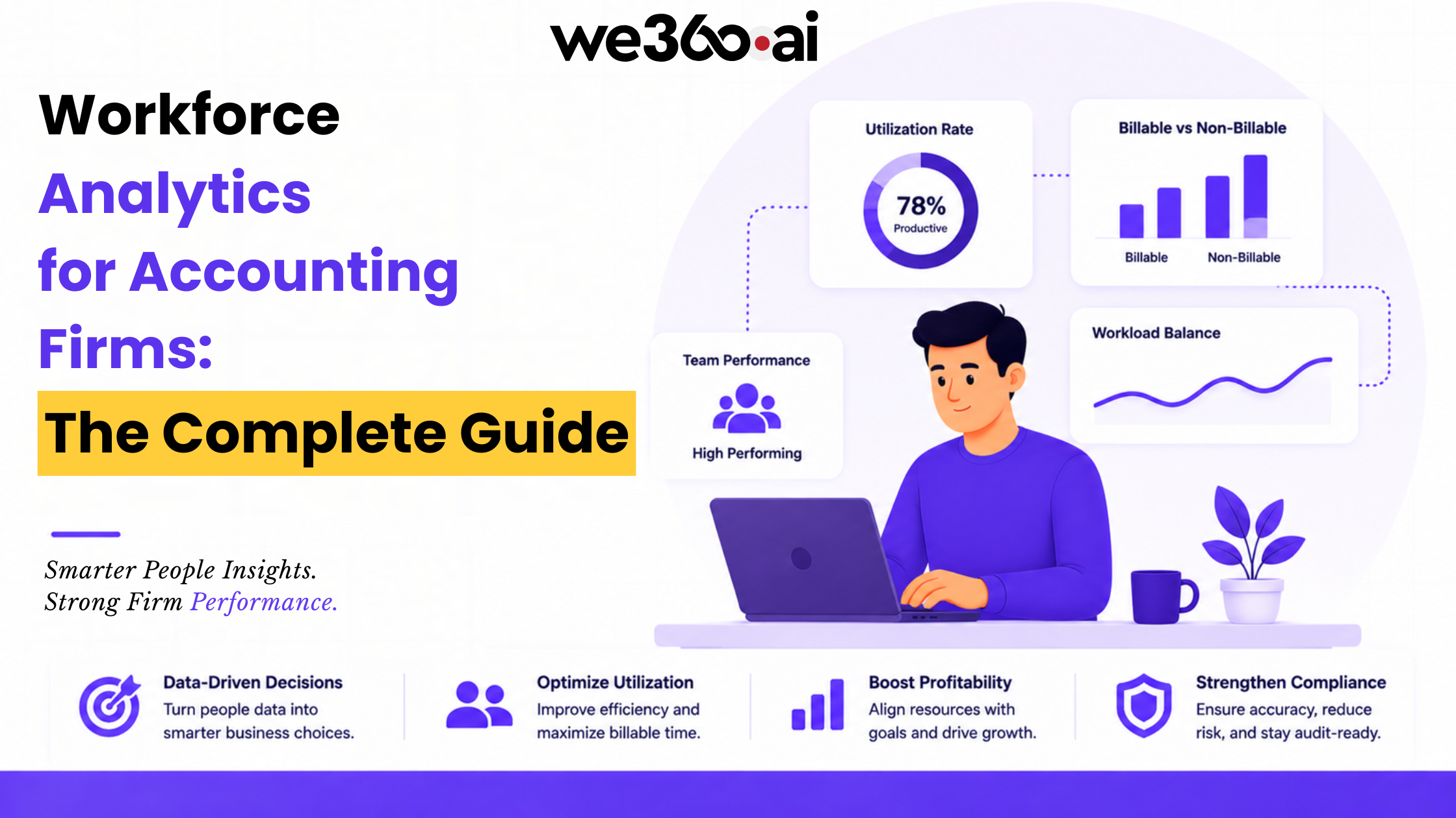
What is a Workforce Analytics Platform?
A workforce analytics platform is a digital solution that aggregates real-time data on employee activity, productivity, and engagement into a centralized interface. By utilizing automated tracking and AI-driven analysis, it provides a holistic view of organizational health, helping leaders optimize workflows, manage labor costs, and support employee wellness. The core value of such a platform lies in its ability to turn fragmented digital signals into clear, actionable business intelligence.
Functional Mechanism: How Simple UX Drives Performance
The effectiveness of We360.ai lies in its "human-centered" design approach. The platform functions by collecting granular data from workstations via a lightweight agent and organizing it into high-level visual summaries. This process ensures that data is not just present, but communicated effectively to the end user.
The platform collects data such as application usage, website visits, and keyboard/mouse activity patterns. This raw information is then processed and displayed through a "Rule of 6" visual hierarchy, ensuring that no more than six key visualizations are grouped together to maintain focus. This prevents the "trading terminal" effect where a screen is too cluttered to be useful.
We360.ai provides insights into team engagement and burnout risks by visualizing activity trends over time. For example, a simple color-coded timeline can highlight if an employee is consistently working excessive overtime, allowing for proactive workload redistribution. The software also helps organizations identify "software ROI" by showing exactly which licensed tools are being used and which are sitting idle.
By offering a single dashboard for multiple parameters—such as attendance trends, top performers, and productivity scores—the system makes performance evaluation an effortless process. This structured simplicity allows managers to complete their daily pulse-check in minutes rather than hours.
The Strategic Importance of Simple Dashboard UX
For growing organizations, the simplicity of their internal tools is a direct contributor to their scalability. As teams expand, the cost of "bad UX" compounds in the form of lost time and misinformed strategies.
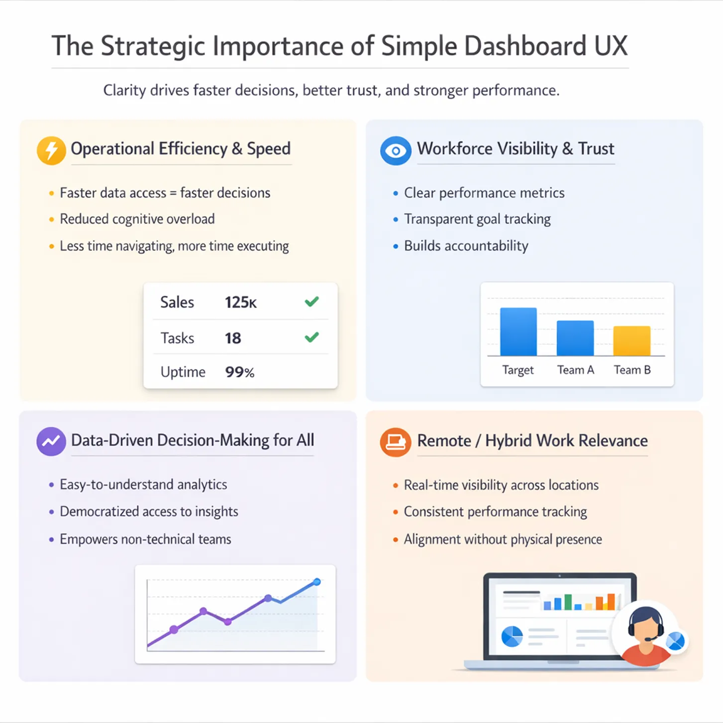
1. Operational Efficiency and Speed
Simple UX boosts daily wins by reducing the time spent on "data janitoring." When a dashboard is intuitive, managers can spot anomalies—like a sudden drop in project velocity—instantly. This enables a shift from lagging indicators to leading indicators, allowing for real-time adjustments that keep projects on track.
2. Workforce Visibility and Trust
Transparency is the foundation of a healthy culture, especially in hybrid workforce management. A clean, objective dashboard provides a "single source of truth" that both managers and employees can trust. When performance metrics are clearly defined and visually accessible, it eliminates the bias often associated with subjective reviews.
3. Data-Driven Decision-Making for All
One of the primary goals of modern enterprise productivity tracking is the democratization of data. Simple UX ensures that middle management and team leads—not just data scientists—can leverage analytics. This empowers a wider range of leaders to make data-backed decisions regarding resource allocation and capacity planning.
4. Remote / Hybrid Work Relevance
In a distributed environment, the dashboard acts as the digital "office floor." It provides the visual cues that are lost when people aren't sitting in the same room. A mobile-responsive, simple interface ensures that this visibility is maintained whether a leader is at their desk or traveling between locations.
Transform Your Daily Routine with We360.ai
Optimizing your organization starts with optimizing your view. We360.ai provides the clarity you need to move beyond raw data and into the realm of actionable intelligence. By choosing a platform that prioritizes a simple, powerful user experience, you empower your leadership to make faster, smarter, and more empathetic decisions every single day. Experience how a "Dashboard That Just Works" can redefine your team's success. Start your free trial today.